Web design process for Athelas
A journey through two worlds and the design process of a web site for a web developers agency. The result, the client was very happy and I am excited to finally see it published soon. From the language menu to the different sections and the journey through the 2 worlds, this website offers a unique user experience and will, for sure, make Athelas stand out from the crowd.
As you probably already know, besides branding, I also do web design (user interaction and the design itself), or what I call branding for web, because no matter how big or small your business is, your web presence is extremely important and probably one of the major points of contact with your customers.
But, even though I do web design, I don't do the coding part. I understand it and try to be on top of technology, languages, and trends to know what can and cannot be done (my experience in motion graphics has been helpful too!), but I don't like or want to code. My strength is design and that's what I'm great at, so instead, I work very closely with developers.
"you had me at <Hello, world!>
On that note, while living in Peru I was lucky to meet the team at Athelas, a web development agency in Lima. Since then we've worked together on a bunch of web projects and last year they asked me to design their website!
Designing Athelas' website was such a fun project that, with their approval, I wanted to share with you the process, so you can have a sneak peak at] what's involved in projects like this.
The requirements
- It had to be a one-page website, separated by blocks or sections where the background and/or the colors changed. These sections had to feel integrated and the whole design had to work together.
- The sections where:
- a catching/intro phrase area
- portfolio differentiating client work from their own products with a tag or label
- meet the team
- testimonials
- contact, with a hidden panel showing average package costs.
- They wante their existing logo and brand personality to be very present, while keeping the design mostly flat, modern, fun and clean.
- They wanted to differentiate themselves clearly from other local development agencies, who had very structured, straight-forward and not very playful websites. They wanted their personality to shine through.
- Work timeline: 1 week
- Their whole theme was based on phantasy, online video games, lord of the rings kind of feel, and this is the image they gave me as a reference to start:

- The "meet the team" section had to be interactive and unique. They wanted to use "magic cards", but apparently I am not nerdy enough, so I had to look it up:

Typical magic card

I like this funny version better....
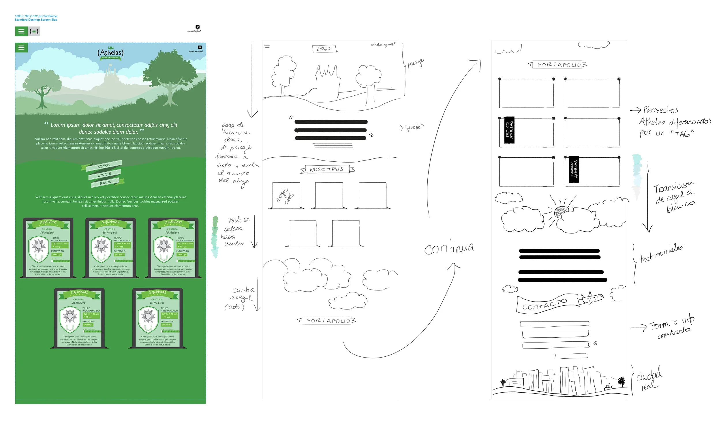
They were on a hurry, so we got to work right away with a rough wireframe.
Following the concept of a fantasy world and inspired by the story of Jack and the Beanstalk I came up with the idea of having the "World of Athelas" – castle included – exist above the real world, showing the website content in between the 2 worlds. As visitors scrolled down, they experienced the different layers between the fantasy world and the real one:

With the wireframe approved, I moved on to the design process. First tracing the background image and cleaning it up a bit, and then adding some more details.
As I do with my clients, I wanted to get their feedback early on, to make sure we were going in the right direction, so I presented them just the first section of the design, where we selected the typography, colors and other design elements, including the magic cards:
Design version 1:

With this early design approved, I moved on to the rest of the website, creating transitions for the different sections and details for the "magic cards".
Design version 2:
In this second version I showed how the menu and the logo would change as the user scrolled down.
Based on their nick names, I came up with icons for each person's magic card. I also gave them 2 alternatives for their website portfolio presentations, among other ideas...
Design version 3:
After reviewing version #2, we decided the flow would work better if the portfolio was above the "meet the team" section. Changing the order though, resulted a bit more difficult than anticipated. I wanted to keep a sober background color that wouldn't interfere with their portfolio pieces and the transitions didn't work as well that way...

Another element we worked on were the magic cards. The idea was to have these magic cards be interactive. If a programmer was "on duty" actually coding, users could see the hours worked and the progress bar moving. As they reached certain amount of hours, the bar would change into a "completed" state. It also had to show the developer's "specialty language", nick names and real names, and a short description text. We also wanted to differentiate "active states" versus "offline states", so I came up with two alternatives:
- Making the "offline state" blue (almost duotone) to highlight the "online" ones.
- Adding a thin yellow line around the "online" magic cards, which was a more subtle alternative and the one that got selected.

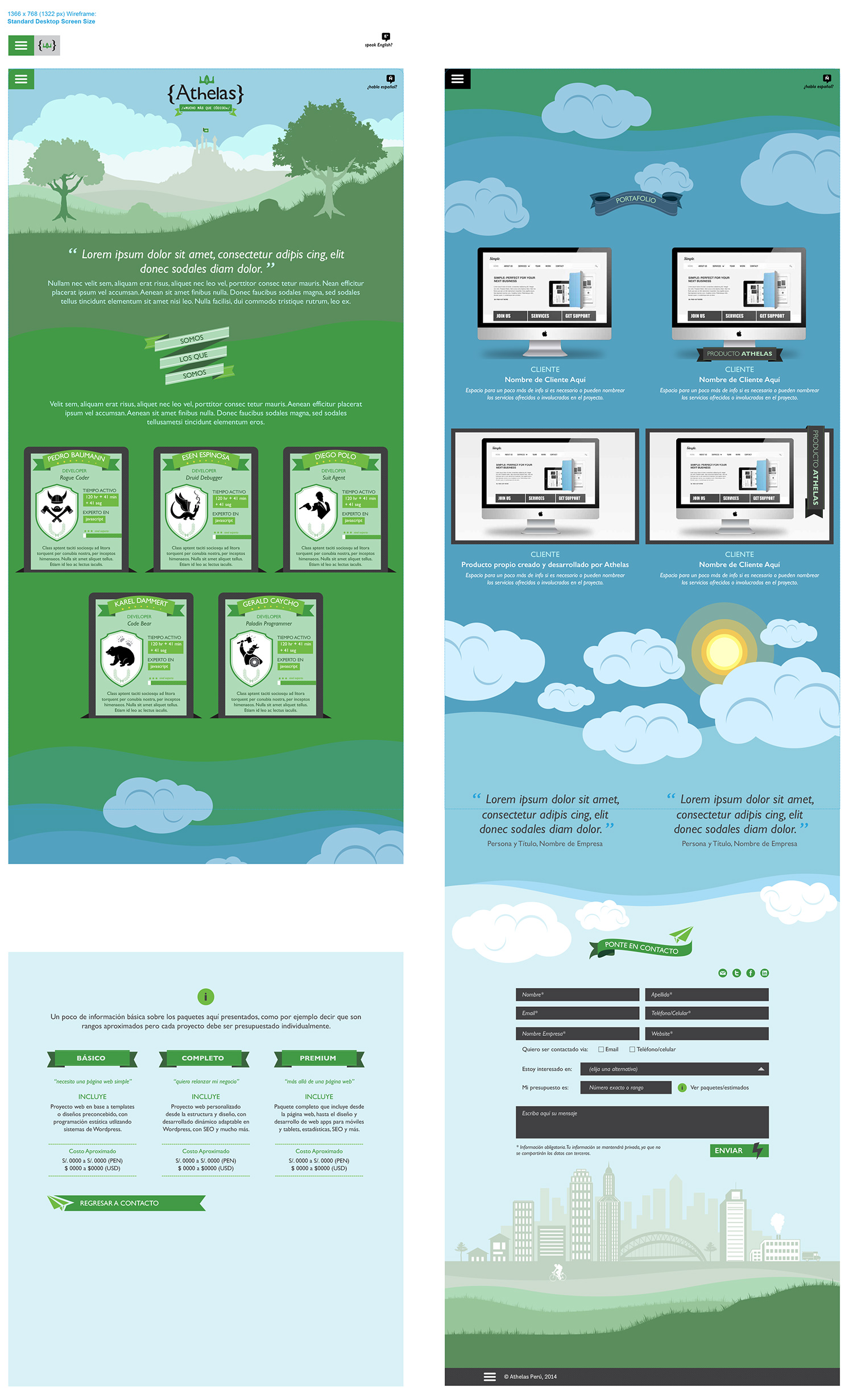
Final version:
Since the background transitions weren't working in version #3, I came up with the idea of going beyond the sky and into the galaxy, to separate the two worlds. This "out of space" idea worked well, because it allowed me to have a dark sober background for their portfolio pieces and a much needed transition back into the "real world sky". It also created a more evident distinction between the two worlds.
We also decided to change the typeface. The client wanted to use Gill Sans, but needed a more web-friendly typeface for the web, so we went with Alegreya Sans, which shares a few aesthetics elements of Gill Sans, but is meant to be use and read on screens, and has a large family (versions) for versatility:

Screen views as users scroll down:

"Restrictions" are sometimes just challenges that push us to come up with more creative ideas. In this project, for example, I had a time restriction, but at the same time, because it was a developers' website, it offered unique opportunities for fun stuff like "easter eggs".
From the language menu to the different sections and the journey through the 2 worlds, this website offered a unique user experience and made Athelas stand out from the crowd. They went from being 2 developers working from home, to having 4+ employees, a full-time office and new online services being launch this year. The client was very happy and I'm proud.
Visit their site at: www.athelas.pe
Logo design process for Dosis
In this post, I want to share the design process that let to the brand "Dosis – Design Experts", which was developed in 2012.
The most common phrase I hear when I say I'm a designer is "I want a logo!", which is just a starting phrase that leads to a long conversation about branding. Yes my friend, branding is what you need, a logo can't do all the selling work for you business. Having a coherent and consistent brand with a clear message can become and incredible valuable asset.
But creating a brand is no lame lazy job, it requires a lot of effort, time, a clear idea, a good service/product and lots of back-and-forth... This is why I thought you would be interested on taking a look at what's involved in the design process of a brand.
In this post I want to share the work done for "Dosis – Design Experts", launched in 2012. The client had already registered the name and tagline, so we went straight to developing the creative brief, where we were able to define all the key information about their brand, objectives, goals, as well as key concepts:
“Dosis is a boutique interior design studio, with a 360 kind of service, that goes beyond just decore, covering all the client’s needs. We want to give our clients ‘a dosis’ of style and art to their lives”
The brand had to inspire curiosity and playfulness, but also classic elegance and creativity, so concepts of vintage looks, textures, hand-made elements, and bright colors were important to maintain. The client specifically requested to have a typographic logo and a secondary version to be used as a stamp.
With this in mind, along with all the information gathered in the creative brief, I started with an esencial first step. The moodboard (you can download the complete moodboard here):

I worked with the client to narrow the complete moodboard to essential visual examples that communicated the "look & feel" of the brand we wanted to create. From the moodboard we also extracted a starting color palette:

There are great tools to create color palettes. I tend to use the images of the moodboard to find the colors and for that I either use Photoshop (pixelating the images to the max) or online tools like Color Scheme Designer, Colour Lovers, or Paletton.
With the moodboard and color palette alternatives set, I started the design process. Always with pen and paper, because my brain just works better that way... here are some examples of that:
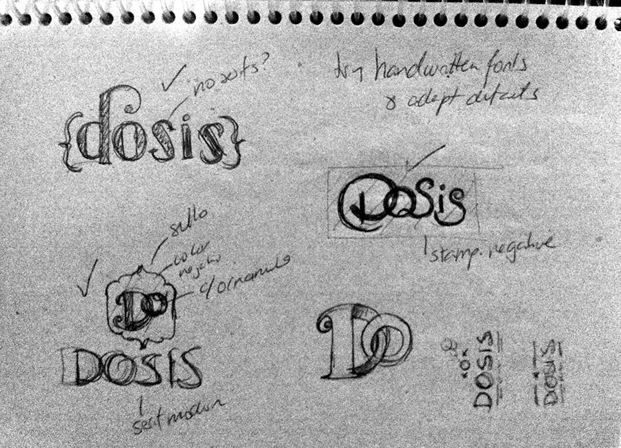
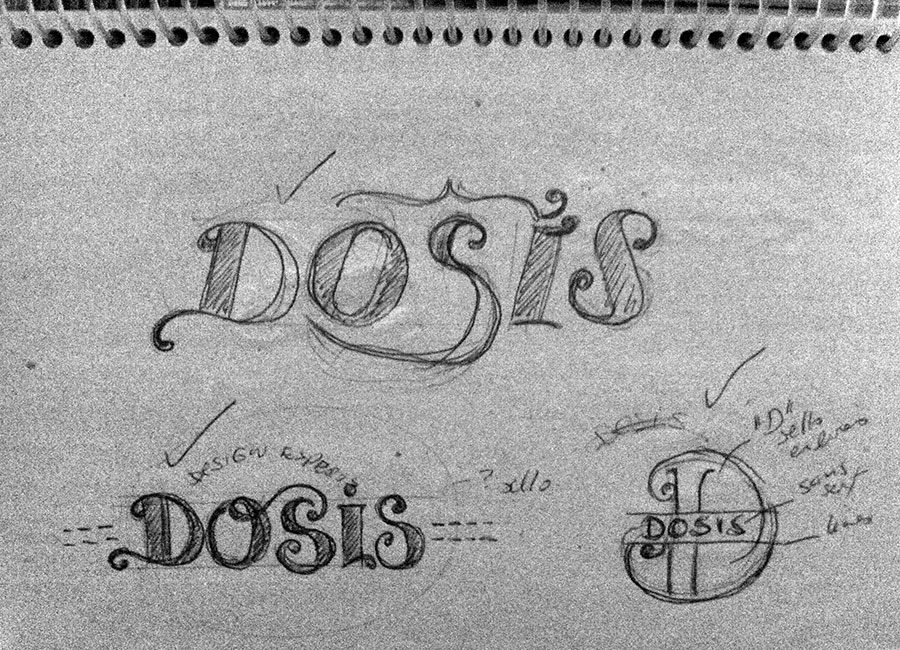

Depending on the client, sometimes I actually involve them early on the design process. Some people are better visualizing "designs in progress", some are not, so I'm cautious about it. In this case, since both partners in the company were designers, I actually showed them some sketches early on in the process.
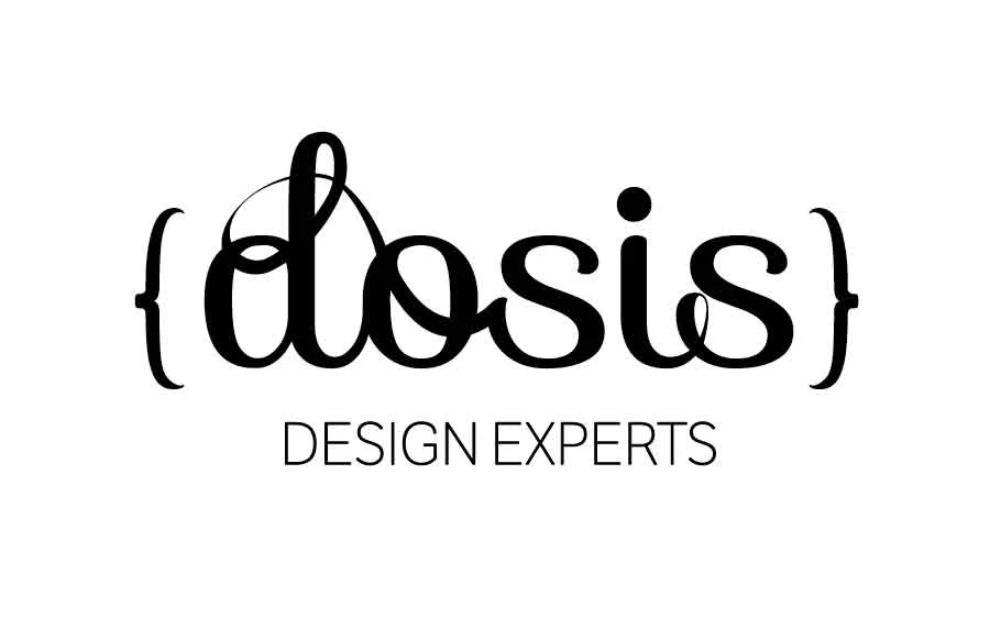
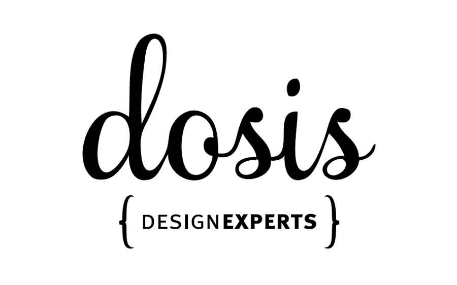
From here I started to edit the ideas to create clean designs in the computer, giving the client different alternatives. I always start only with black and white designs, so we can focus on the forms first.
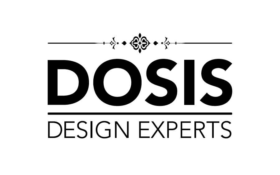
PRESENTATION 1


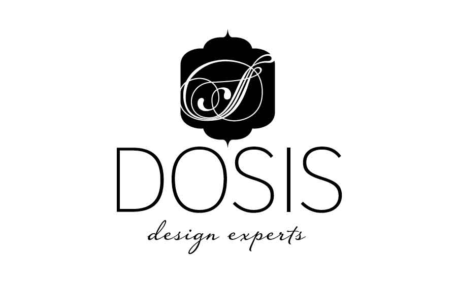
After this presentation, one of the business partners decided she wanted to see some more modern options with a bit less vintage feel, and thicker fonts. So we set up to explore that, while maintaining the key concepts established on the creative brief.
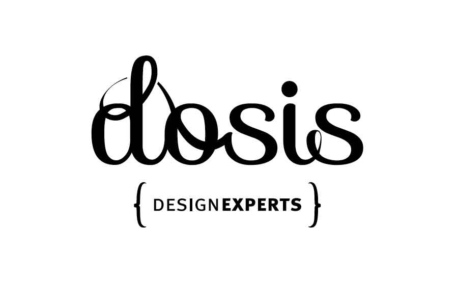
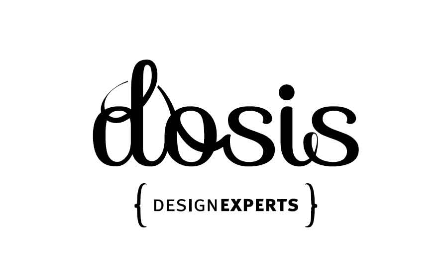
PRESENTATION 2
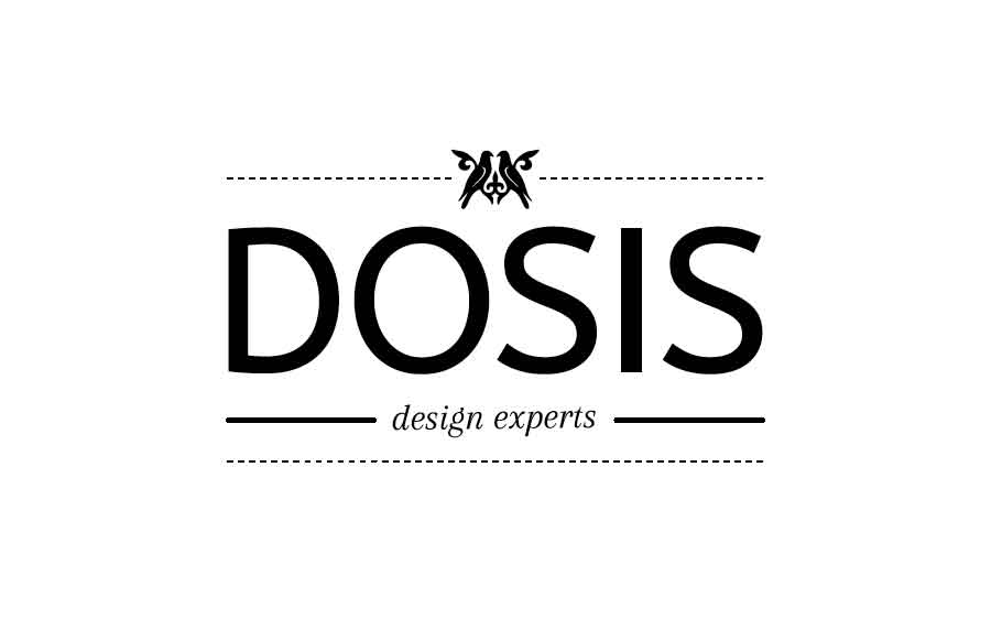
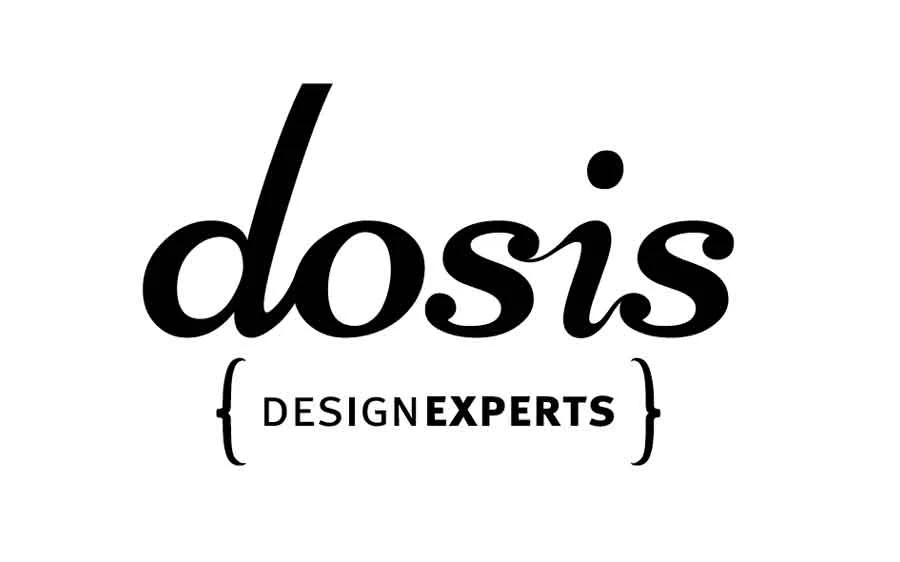
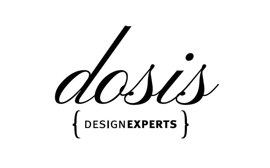
We did 4 rounds of designs, each presentation carrying between 3 to 5 alternatives. After a few back-and-forth, one logo design constantly survived since presentation #1, and was eventually selected as the right alternative.
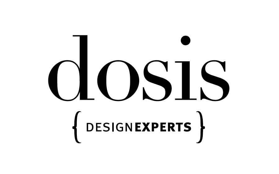
PRESENTATION 3
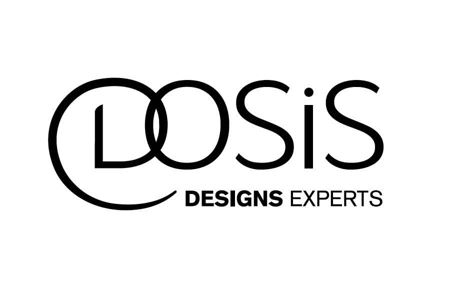
This was one of those situations, where the client loved a design since the first presentation, but was still curious to "see what else is up there". This was actually good for the design, because it allowed us to validate the logo against other alternatives and helped the client feel confident about their final decision.
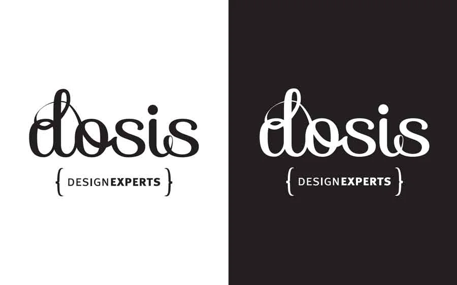
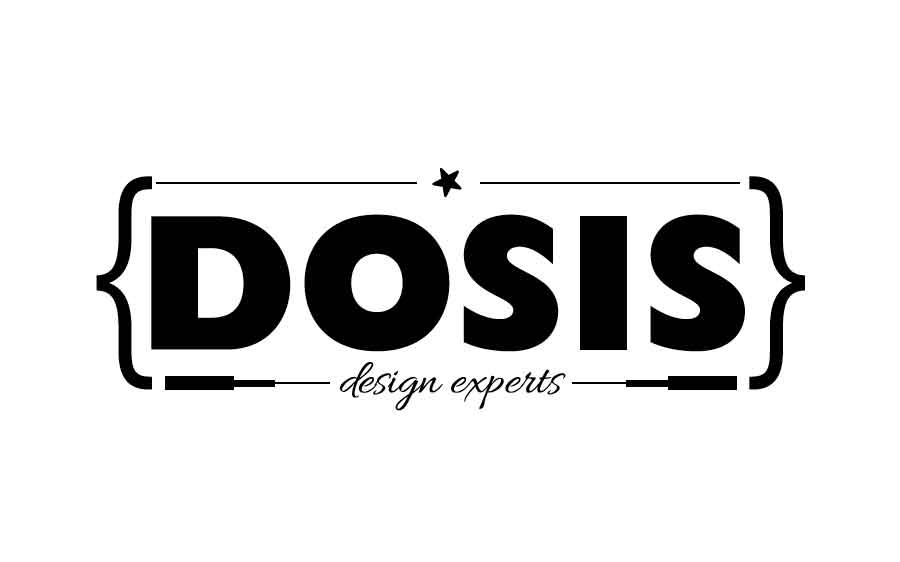
THE APPROVED DESIGN:

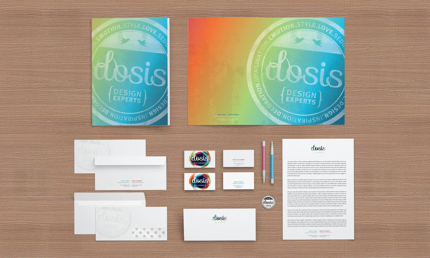
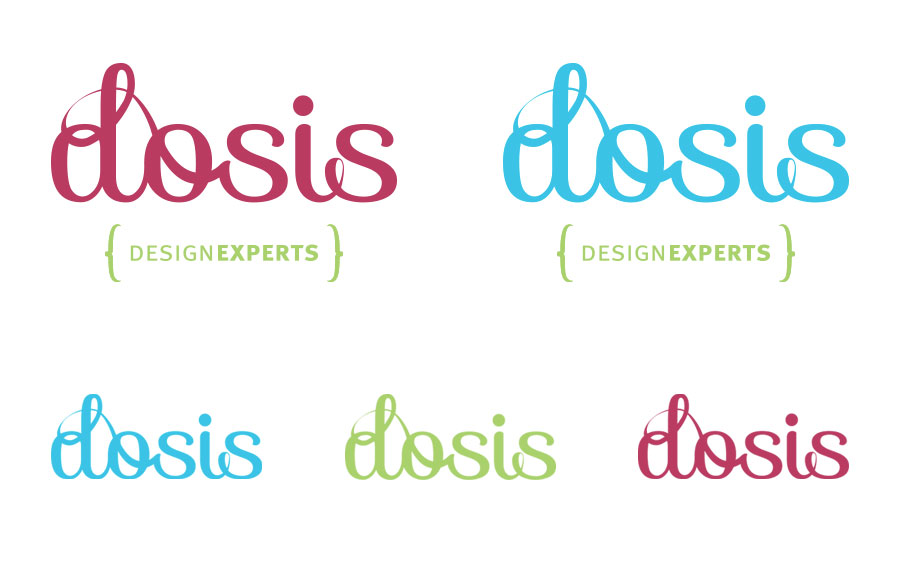
From here we started working on adding color, texture and creating different applications for a very flexible brand image:
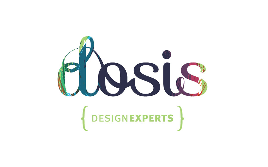

And of course, the seal, which was then applied to the stationery and eventually used in their floor-plans a "quality seal":