
Featured Article
World traveler settles in Mechanicsburg offering graphic design help to businesses
A few weeks ago I was invited to chat with Rachel Andreoli, who writes a column for a local newspaper here in Mechanicsburg. It was a fun and warm conversation and I am very grateful she took the time to meet me and learn about what I do and how I do it. The Sentinel column highlights local businesses and entrepreneurs:
Cumberland County has no shortage of residents with unique talents and independent spirits. From artists to mechanics, office workers to outdoor professionals, these entrepreneurs showcase the best of what businesses in the county have to offer.
Every week, The Sentinel’s Small Business Spotlight will feature these people and share their stories.
Discover your local connection through this series that focuses on small business owners in your own backyard and highlights the services they provide for their community […]


Why I volunteer for Unamonos
I have been involved with the Unamonos Association for many years, currently as part of the Board of Directors, but there’s an important history people need to know to understand why I continue to stay connected to this organization in the south of Peru…
My story with the Unamonos Association, a non-profit located in the south of Peru, in the city of Arequipa, started even before I was born. Neither me nor my siblings know life without talking about disability. To understand why it is important for me to stay involved with this non-profit, you have to know the story behind its creation:
My oldest sister, Claudia, was born healthy in 1972 in Lima, Peru, when our parents were only 25 years old. However, a few weeks after she was born, my mother noticed that she was not moving normally and was losing strength in her neck. When she went to the doctor, he told her that “it was nothing, just the nerves of a first-time mother” and sent her home again. But the problems continued and when she went to other doctors, they discovered that my sister, like other babies born in the same hospital, had been infected by staphylococcus. Unfortunately, since it was not detected in time, the meningitis had advanced, causing a series of serious and irreversible damages to Claudia’s brain. They even indicated that she would only live a few years.
When Claudia was almost 2 years old, our parents decided to move to Arequipa, where my grandparents lived and where her care would be simpler. What they didn't think was that Claudia's presence would inspire so much.
Even though Arequipa is one of the largest cities in Peru, my grandparents, along with a group of relatives and friends, noticed that there were almost no services for children with mental disabilities. They knew that there was already a group of women who supported children with mental disabilities from low-income families in a hospital. Inspired by Claudia and other children with disabilities, they decided to join forces. Thus, they officially created a non-profit special education school where these children (and their families) could receive the care they needed. In 1974, the Asociación Unámonos was born, which to this day serves children and adolescents with different mental or cognitive disabilities.
“Our sister had many difficulties: comas, seizures, difficulties communicating, among others, but Claudia’s story taught us a lot about resilience and transformation, changing our lives and the lives of many children and families in southern Peru.”
Just as our sister Claudia exceeded all expectations - living to 51 when her life expectancy was very short, surviving periods in a coma, recurrent seizures, and learning to walk and eat, even though doctors thought she would never be able to do so - the Unámonos Association has also survived and transformed itself in amazing ways over all these years.
Sometimes we wonder how Claudia would have been like without that injury… What would the family dynamic have been like? But we have realized that Claudia and the weight of what her injury meant for our parents and the entire family taught us many things: that strong relationships can be simple, that there are many ways to communicate love, that a loving look is sometimes all that is needed. Her presence and the countless challenges activated a capacity for mutual support in our family, turned us into a highly resilient team, highlighted human courage, full trust, and each in their own way, unconditional love.

Just as our family was transformed by Claudia, the community in Arequipa was transformed by Unamonos. An incredible support network was activated, which began with the family and spread like a wave to friends, colleagues, and the community. Unknowingly and in silence, Claudia's life drew a cord of love that cannot be broken. Today, the Asociación Unamonos school continues to provide educational services to children and adolescents, but complementary services have also been created: early stimulation for babies, guidance for families, activities in the city to promote the inclusion of people with disabilities; as well as labor inclusion programs, which allow young people who have finished their studies to work in different organizations - from restaurants to factories, offices, and manufacturing workshops. In addition, it is the only organization in southern Peru with a band made up 100% of children with mental disabilities.
Over the years, Unámonos has changed the lives of more than 4,000 babies, children and young people, and their families, so that they can develop their skills, find opportunities and feel part of a community. And it has done so by helping mainly low-income families, providing free or low-cost services.
Claudia died at the age of 51 in 2022 and we feel that Unámonos honors her life. Her memory and life continue to remind us that love is unconditional, that even when we cannot communicate verbally, we can understand each other, that we may be different, but we can be united by our humanity. When we arrive at the association, we not only remember that Claudia inspired its creation and attended the school, but we are surprised by how this work that she sowed has spread to other families.
What is my role at Unamonos nowadays…
Geography is an issue. I live in the United States, Unamonos is located in Arequipa, Peru (South America). I, unfortunately can’t be in person often for hand-on events or volunteer work, but technology is awesome, so I am now supporting Unamonos through the Board of Directors. We meet once a month online. Because Unamonos is a non-profit organization, working mostly with low-income families, our goal is to make it sustainable, trying to diversify donations, creating fundraising and awareness events, and involving the business community.

Family photo in 2002, Arequipa – Peru
In 2016 I was invited to talk at Boulder Ignite-13 to tell my family’s story as a catalyst for my work today…
Do you want to know more? Here are some way you can join us:


Branding Case Study: Resolute Brewing Co
“Daniela was able to take a cacophony of ideas and directives, and transform them into an inspired and lasting brand for our brewery. We couldn’t recommend her enough!”
If you are interested on doing a rebrand or creating a brand from scratch for your new business adventure, this post will give you an idea of what's involved during the design process.
Resolute Brewing became a client thanks to a recommendation from a dear designer friend, and it was a dream project for me, not only because it was a great design challenge, but also because of the subject. I love beer! and as a craft beer fan, I pay special attention to this industry, their visual flexibility, and their thirst for innovation. Designing a new brewery brand from scratch was a golden carbonated opportunity for me.
When I do branding projects, I ask a lot of questions, because I truly want (need) to understand what you are looking for in your business, all the whys behind it, and what your expectations and needs are, so together, we can create the best solution to your needs
The partners at Resolute had done their homework. They came to me with a clear idea of who they were as a company, why they were doing this, and who they wanted to target. So, I gathered all that information and right away moved on to step 1, writing a creative brief:
STEP 1
The creative brief = your brand's foundation
Based on the information they provided, I developed a creative brief with more details. Below is a synopsis of that brief, with key information that was included in every presentation, to serve as a reminder of what we were looking for and their brand essence.

Sinopsis of creative brief
STEP 2
We play with words
With a finalized creative brief, we worked on a word map. Sometimes this is done with post-its, sometimes digitally. Techniques vary, but the goal is the same.
On a word map, we lay out the key concepts that represent the brand. This helps narrow down ideas to single words, using visual hierarchy, therefore making it more specific. In addition to this, you can find connections between concepts, which helps define them and allows us to clearly identify the most important concepts to consider.

Word map
STEP 3
Create a vision, so you know where to go
Inspired and guided by the word map and the creative brief, we gathered visual examples that expressed and represented those concepts and values. This is called a mood board or “vision board” and it helps define the brand visually to make sure the design we will be creating aligns with the brand’s personality, values and goals. Mood boards serve as inspiration and guidance:

Mood board
STEP 4
Let's see some designs!
Even though the first 3 steps are essential and probably the most important part of the process, in step 4 is when you really will get excited, because that's when you will see your company’s logo come to life.
Branding projects usually have a set amount of revisions, so it's important to take the time to consciously review the designs.
In the first presentation, I always show logos in black and white only. The reason for this is so you can focus on the shape and concept of the logo first, without being influenced by color choices.
The human eye sees shape first, then color, but color has a very deep emotional effect on us, so it’s important to separate those two stages, to make the right decisions for your company.
It's not about personal styles, your or my personal taste, it's about what's needed for that project, for your business and for the brand.
Round 1 of designs
The first round of designs is the perfect opportunity to explore different paths and alternatives. Even though all the designs are based and inspired by the same creative brief, word map and mood board, there’s always different ways to express those concepts.
In this case, each alternative was focused on one concept more than others, and all included a 1x1 format:
Alternative 1 (Round 1)
Inspired by a navigation compass used for sailing and by thermometers used during the beer making process. This modern design resonated with the idea of a company that grows and “navigates” using strong values and commitment to the community as their guidance. A modern san-serif typography is well balanced with the compass symbol, bringing visual stability and hierarchy to the logo.
Alternative 2 (Round 1)
This modern alternative was inspired by “the science of beer making” and the concept of precision. The spelling of the name and the letters are used as graphic elements, which combined with geometric forms, representing the mountains of Colorado, created a clean, honest, and easy to identify logo.
Alternative 3 (Round 1)
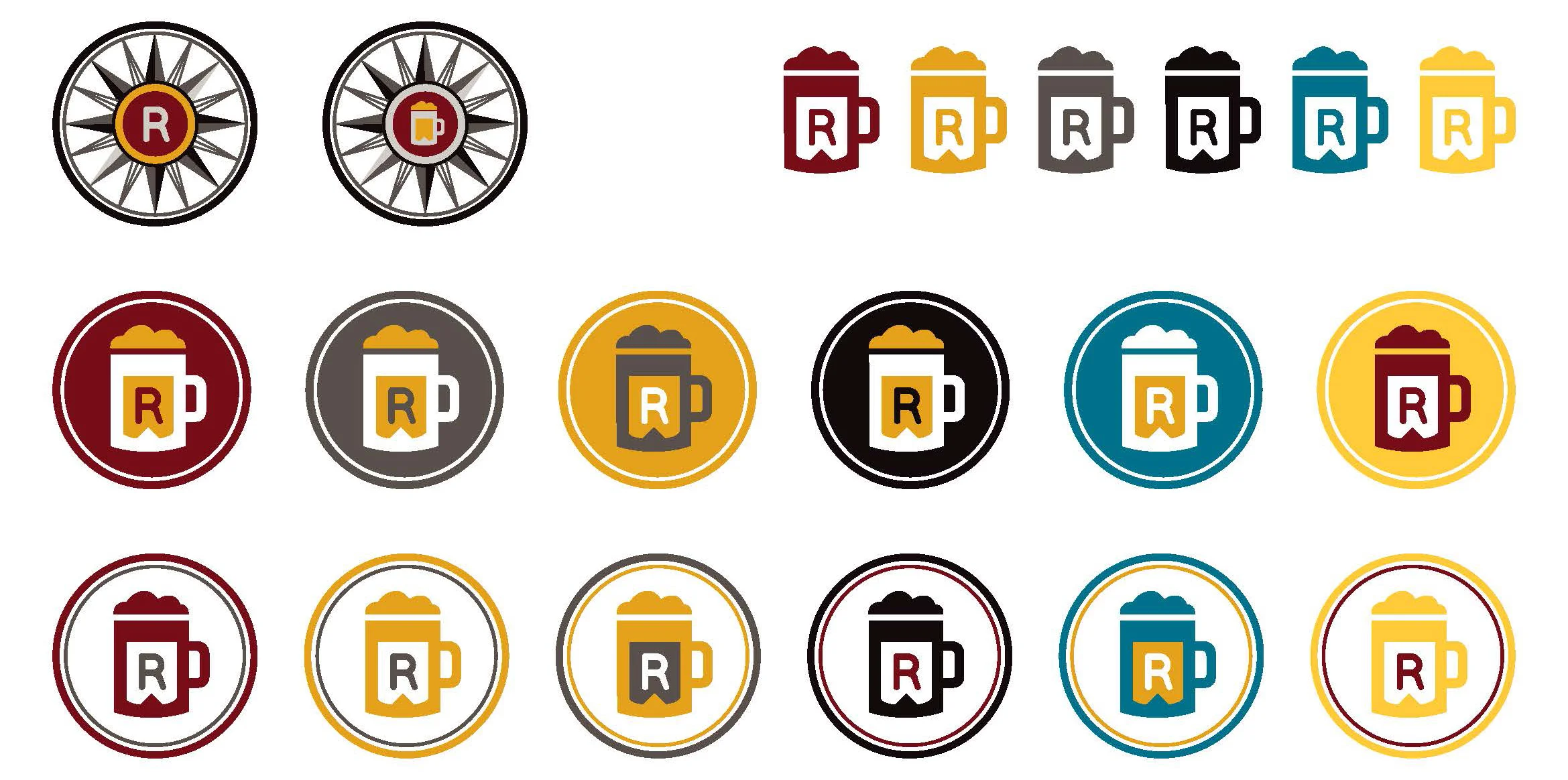
This design was inspired by western graphics, but with a modern. The arrows are made of barley, to represent not only beer making, but also direction, strength, wisdom, and courage, as well as the idea of collaboration. These arrows/barleys are surrounded by key symbols: the letter “R” for Resolute, a heart for generosity and passion (helping others, the idea of family and friends, passion for beer making, and helping the community), a beer mug to represent craft brewing, and a hop plant as an essential beer making ingredient.

Alternative 3 (Round 1)
This design was based on the concept of “principled”, represented through a "signature" style logo, as a unique visual representation of a person. Comes from the idea of “putting your name on it”, making a promise and signing a commitment, which resonated with the strong values of Resolute towards the community. A great beer would have the brewery “signature” as a high-quality stamp.
Alternative 4 (Round 1)
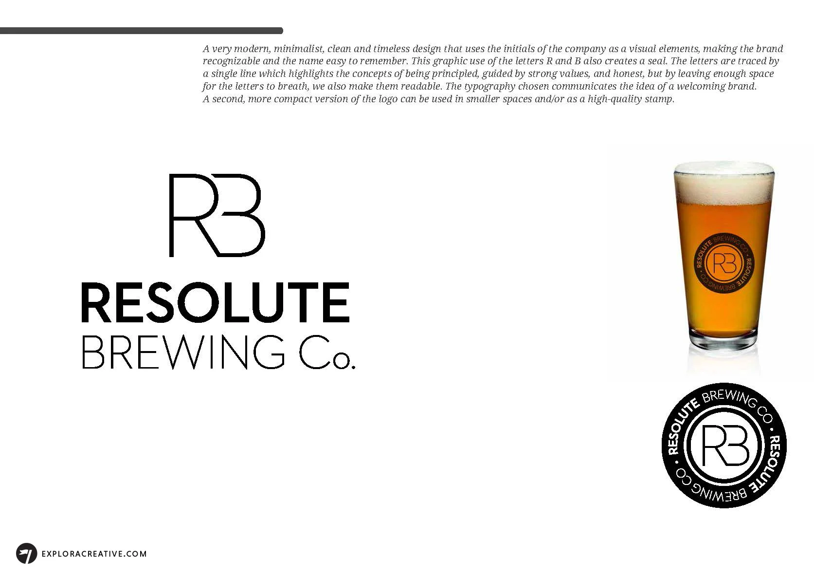
This alternative was inspired by modern, minimalist, and clean design styles, using the initials of the company as visual element to make the brand recognizable.
The letters were traced by a single line to highlight the concepts of being principled, guided by strong values, and honest. Leaving enough space for the letters to breath made them more readable. The typography communicated the idea of a welcoming brand.
Round 2 of designs
With the client’s feedback, I worked on round 2. Resolute selected a couple designs and mixed and match elements from different designs.
At this point we also started exploring color palette alternatives, keeping in consideration the local competition:

Color palette alternatives and local competition
The designs presented included versions in black and white first and then their application to the possible color palettes:
Round 3 of designs
With the client’s final feedback, I set to tweak and finalize the selected design:


We also selected the final primary and secondary color palette:

Final color palette
Final designs and collateral pieces

Brand system: black and white icons
Brand system: color icons

Stationery


Coasters

Social media graphics for events and marketing pages


Application of brand to beer taps and staff wardrobe

Poster design for Collaboration Fest to host both Resolute's and Upslope's brands under one concept. Hand drawn illustration.
Being an entrepreneur is very exciting, but also requires that you consciously take the correct first steps, so your company can have a solid foundation. This is especially true when creating a new brand, because that's the essence of your company. Every single part of the brand system (meaning all visual elements that represent your brand) become the face of your company, so you should make sure it reflects your brand’s personality, values, and tone, so you can reach your ideal customers and grow.
I believe is much better to work in short iterations, involving the client from the beginning and throughout the process. The truth is, we need each other, because I might be a specialist in design, but you, the client, are the expert on your business and you know your company better than anybody. That for me is the best scenario for collaboration, and with an honest, respectful relationship, we can create beautiful, meaningful results.
Project details
Project duration: 2 months
Official launch: July 2016
Status update: Resolute is growing fast and the tap room stays busy all week. In 2016, their Hefeweizen won the Gold Award at the All Colorado Beer Festival, and their IPA got the Bronze. For the Collaboration Beer Festival in March 2017, they are collaborating with Upslope to create 2 limited edition beers.

4 easy tips to fall in love with your designer
In every successful relationship, there has to be trust, and the relationship between clients and designers is no exception. Throughout my career, I have seen people hesitant and nervous when working with designers. Like a first date, if it’s the first time they are working with a freelance designer, there’s a cloud of doubt.
Let me help you improve that for next time.
In every successful relationship, there should be trust, and the relationship between clients and designers is no exception. Throughout my career, I have seen people hesitant and nervous when working with designers.
Like a first date, if it’s the first time they are working with a freelance designer, there’s a cloud of doubt. I have heard things like “I don’t think visually, I’m out of my element here”, “I’m not a creative person, so I don’t understand how this works”, or my favorite “I don’t know how to explain what I want, I’ll know when I see it”.
Sounds familiar? well, let’s take it step by step.
Note: if you have worked with freelance designers before, you might think this post is irrelevant to you, but I think you can still find beneficial information that can help improve your relationship with designers in the future.
Step 1: Relax

You are in good hands; experienced designers are here to help you. Be assure we want your business to succeed as much as you do. Why? because if you do well, we do well. If your company succeeds, we can not only brag about it in our portfolios, but it also means you will want to work with us again, and that’s more business for us.
So, be open to listen to our advice, especially if we are presenting specific reasons why we recommend something. We want what’s best for your brand. I’m not saying you need to agree with us 100% of the time or do exactly what we say, that’s not good either. The best results happen on a two-way conversation, and this brings me to step 2.
Step 2: Do your homework

Now that you know you are in good hands, it’s time to get to work. For a successful project to happen, we need to collaborate, and that means you need to do your homework too.
The best scenario for collaboration is knowing that we need each other. We, the designers, specialized in print, branding and/or interactive, are specialist in design. We have the knowhow on that field, but you the client, are the expert on your business. You know your company better than anybody, and we need to work together.
And if you are wondering what your homework is exactly, below is a simple chart explaining what you need to bring or think about when starting a new design project:
BRANDING
- A registered name. Make sure you can use the name you want before you hire a designer to do the logo.
- A creative brief detailing your company’s background, goals, your target audience, your primary and secondary competitors, and most importantly, the why behind everything.
INTERACTIVE
- A digital creative brief detailing who's the audience, why does your web/app exists, what are the 3 main tasks or purpose you want users to accomplish while they are there, what are the secondary tasks, what is your web/app goal, and any other data you think would be important for us to know.
- Do you have content for this website? if not, where is this content coming from and/or who do you think would oversee creating it.
- Do you have content? if you don’t, ask us for advice to find a good creative writer.
- If you have content, text specifically, please organize it in a Word document, so we can review and understand it easily.
- For images, PLEASE don’t send images/photos in power points or Word documents, you will give your designer nightmares and we won’t be able to use them.
- Do you have a printer you want to work with or do you want recommendations?
Step 3. Give high quality feedback

By this I mean the following:
A. Give us consolidated feedback
If you have a partner in your business, if there are other decision makers, or if you want other people’s input, let us know early on. We need to know who is involved in the process, who is the person making the final decisions, and who we’ll be the designated single point of contact. This will avoid confusion and possible setbacks.
After you hear other people’s opinions, gather all their comments and note only what you think is relevant. If you have questions, mark them so you can resolve them with the designer’s help during your next meeting or call.
From my experience, when a client brings comments from other partners that haven’t been resolved internally first, the project gets delayed. We, unfortunately, can’t make the decisions for you, designers can and will make recommendations, but somebody from the client side must decide and approve designs to be able to move on with the project.
B. Give us relevant feedback
Every stage of the design process usually requires approval, so we need to focus on those key decisions as the work progresses. For example, if we are in the process of designing a logo and it’s the first round of designs, concentrate on giving us feedback related to that first. If you have references or ideas for other parts of the process, for example for the stationery or the web design – those are always welcomed – note them and mention to the designer that you have some thoughts, but make a priority to resolve the impending logo questions first.
And most importantly: don’t be afraid to ask questions, we are very happy when clients ask questions and it’s your absolute right to ask us to clarify.
Step 4. Sign a contract or work agreement

A lot of designers, including myself for a while, didn’t work with a signed contract or work agreement. Most of the time this is OK, but I fully believe the relationship is better if both parties have all the details figured out in advanced and in paper for full transparency. That way they both know where they are standing and what to expect from each other.
It doesn't have to be a complicated contract, but these are some of the items you will most likely see in an agreement with a designer:
A. Project or item cost and what does that include:
- For most projects, there is an X amount of revisions (3 to 5 are the most common numbers). Each designer, depending on the project and budget, can be different, so make sure you have that information ahead of time to plan accordantly.
*Tip: Having less than 3 revisions is unusual, unless the project has a tight schedule or a limited budget. If that’s the case, it might also include a rush fee.
- Advance deposit: most designers, including myself, work with an advance payment. This covers the hours used until the project is completed. Sometimes this is done 50% in advance / 50% upon final submittal, but sometimes it can also be divided in to 3 payments of 30% / 30% / and 40%.
B. Roles of key people.
- From the designer’s point of view, we need to know who’s the decision maker, who’s our single point of contact, and who’s involved in the project. From the client’s point of view, you need to know what are the responsibilities of the designer. For example:
- If you are doing website, is the designer also going to code the website? If not (most likely) you would need to request a quote for development separately or ask if it’s included in the project’s cost. Who is going to oversee the uploading of all the content, the client, the designer, or the developer?
- If you are doing a print job, most quotes won’t include the costs of professional printing, fonts, stock photography, and/or photo shoots. How is that going to be quoted and/or payed? and, if the designer is responsible to supervise the printer (most likely) this should be included in the agreement as well.
C. What happens if the project goes out of scope?
If the project's needs change or it’s delayed, are you going to work with the designer on an hourly basis? are there any late fees, rushed fees, or penalties?
D. What does the work schedule look like?
The contact or agreement should indicate at least an approximate start and delivery date, as well as how long each item/service will take (business days, weeks or months) and how many hours are included (unless you work on a flat rate).
Don’t be surprised if you see other items listed on the work agreement or contact. Among those could be: requiring that the client approves a design (in writing) before moving to the next stage. For example, in an interactive project, the designer might state that the design won’t start until the sitemap and wireframes are approved, or that the wireframes won’t start without content, etc. It varies from project to project and from designer to designer.
I hope this helps improve your relationship with designers. The goal is always to have a smooth ride (or not too bumpy). And remember that we are friendly and fun people, but we also take our work as seriously as you take yours.
If you liked this post, please subscribe to my newsletter. I include free goodies that aren’t included in the blog posts. This month I included creative brief templates for branding and web projects.

Should you care?
In the last decade or so, things in the business world have changed. To connect with us, brands not only have to be cool or different or attractive, now they have to care, really care.

In the last decade or so, things in the business world have changed. To connect with us, brands not only have to be cool or different or attractive, now they have to care, really care.
My theory is that with the social media explosion, since the early 2000s, the fact that we now get news pretty much in real time, and the fact that media outlets (traditional and untraditional) can expose things easier, leaving no place to hide for business owners (like they were able to do before), have created a more socially-aware generation. Now you know that a collapsed building in Bangladesh, where clothing was manufactured, was where your favorite brand’s clothes were being made, so now you, the public, the consumer, are also responsible. But it also means you can use your consumer power to demand change, and people have noticed that.
With this, companies have a challenge: either keep business as usual or adapt to what the new consumer is demanding, becoming more responsible for their actions, while engaging and getting more involved with the social, environmental, and cultural issues their consumers care so much about.
At the same time, with a new generation taking over in the business world, companies are now being formed with the social responsibility gene from day one. Now mission-driven businesses, as Explora is, are becoming more common, and this is a good thing.
So, are you wondering how can your business be more responsible? Well, no business is too small to tackle this challenge, we can all do something. But to find out what you can do, there's a few questions you should ask yourself:
Do you know the why of your business? Why did you create it? What value does it bring to customers? Even if your business has been around for years, go back to the core, sit down, take some time and answer this again, you might find out (new) valuable information.
Where can you have the biggest impact? Do you treat your employees well? Are you making their lives easier and more enjoyable? I'm not talking about an annual lunch or party with "team building exercises", that's a work-technique kinda thing. I'm talking about their personal life: income, health, schedule, flexibility, engagement, sense of purpose, open communication, equality, safety... The list goes on, and you might find out there's be plenty of room to improve and engage with them better, even if this is done in tiny little steps over time.
Can you make your production more eco-friendly? Whether it is how you manufacture your products, the packaging, the materials, or the shipping and storing system. There are tons of resources out there that you can research. Talk to your printer, see if the format you use is creating too much leftover paper, see if the type of paper and/or the inks can be more sustainable, or maybe the technique. Your printer knows this more than anybody, and you can always ask for a designer’s help to guide you though it.
How is your immediate community doing? Not only your neighborhood, but your town, or even your local industry. How can you help them improve? Can you share some knowledge? Get involved, engage, care, connect.
Whether in business or in our personal lives, change takes time, consistency, a clear mission, and often, it also requires an investment. Don't expect immediate benefits, but know that the value it will bring in the long run most likely will pay off, because customers look for good brands more and more, they like brands that are engaged and share their believes.
And remember they are not fools, they will know if you are doing this only for a marketing purpose or if you are honestly trying to change, so be trustful.
I want to end this post with some good examples and (maybe) inspire you a little. Here are some great mission-driven companies, who's core business, their reason to exist, is socially responsible:
TOMS uses the one-to-one model, every time a Tom’s product is purchased, a person in need gets help. They work with partners around the globe to provide shoes, sight, water, safe birth and bullying prevention services to people in need, and their impact is bigger and bigger every day. More here.
HOSEG was born as a response to a strong need in the high mountain regions of Peru that claims lives year after year: harsh winters without access to proper clothing for protection. In a country full of gaps and contrasts, Hoseg decided to use business for good with the one-to-one model and operating as responsibly and sustainably as possible. Find out more here.
PATAGONIA is known for top-of-the-line technology for outwear and equipment, but this company constantly encourages customers to buy high-quality products that last for a long time instead of consuming and trowing stuff away, as well as choosing companies that are environmentally responsible. But their most important contributions and core element of their company is their environmental activism, fair-trade and making their supply chain as clean as possible. More here.
NEW BELGIUM works constantly to make their production line as green as possible, through sustainable agriculture, promoting clean air, water and energy use, as well as promoting safe sustainable public transportation, specially by being big advocates for biking. They give back to their community through volunteering and their philanthropy program, where they donate $1 per barrel of beer sold. More here.
EQUAL EXCHANGE is a worker-owned cooperative and leader of the fair-trade movement, empowering farmers and consumers and utilizing sustainable organic agriculture practices. More here.
And the list goes on (and keeps growing). So now, should you care? I say yes.

We are taking flight!
Design is my talent, it's what I know how to do well, it's my gift, I would even call it my super power...
Design is my talent, it's what I know how to do well, it's my gift, I would even call it my super power.
But for a while I was struggling to find meaning for my work, searching for a way to create a positive impact in the world, how could I make my work and business help me have a more meaningful life?
Thinking, going deep, overcoming fears let me to the answer:
Finding purpose + giving back + sharing more...
Welcome Explora Creative!

Daniela-Cabrerizo.com is now ExploraCreative.com.
Through this website you will be able to, as before, see my work and get in touch with me, but now it will also be part of something bigger: with a renewed sense of purpose, I'll help you use design to your advantage + I'll be sharing lots of other surprises and goodies through my blog and email list, so stay tuned!
Explora is a mission-driven business, that creates design that matters, where branding and it's application for the web are done thoughtfully, having your ideal customer in mind at all times, where projects are done based on collaboration, and by being a force for good. One project at the time.

Just so you can recognize me on the streets... here's a sneak peak of my new business cards!
I encourage you to look around and #explore this website, check out my portfolio, suscribe to the blog, and most importantly, come back often!
For all my clients, friends and colleagues that have been with me during this process and the many years of my freelance career, I want to say THANK YOU! Thank you for your trust, support, for your feedback, and your encouragement.

And as everything in life, this is constant work in progress, so your feedback is always welcome! I want to know what do you think about this new brand and website :)
If you like it, please share it with your friends or somebody you know that might need some design help...
Web design process for Athelas
A journey through two worlds and the design process of a web site for a web developers agency. The result, the client was very happy and I am excited to finally see it published soon. From the language menu to the different sections and the journey through the 2 worlds, this website offers a unique user experience and will, for sure, make Athelas stand out from the crowd.
As you probably already know, besides branding, I also do web design (user interaction and the design itself), or what I call branding for web, because no matter how big or small your business is, your web presence is extremely important and probably one of the major points of contact with your customers.
But, even though I do web design, I don't do the coding part. I understand it and try to be on top of technology, languages, and trends to know what can and cannot be done (my experience in motion graphics has been helpful too!), but I don't like or want to code. My strength is design and that's what I'm great at, so instead, I work very closely with developers.
"you had me at <Hello, world!>
On that note, while living in Peru I was lucky to meet the team at Athelas, a web development agency in Lima. Since then we've worked together on a bunch of web projects and last year they asked me to design their website!
Designing Athelas' website was such a fun project that, with their approval, I wanted to share with you the process, so you can have a sneak peak at] what's involved in projects like this.
The requirements
- It had to be a one-page website, separated by blocks or sections where the background and/or the colors changed. These sections had to feel integrated and the whole design had to work together.
- The sections where:
- a catching/intro phrase area
- portfolio differentiating client work from their own products with a tag or label
- meet the team
- testimonials
- contact, with a hidden panel showing average package costs.
- They wante their existing logo and brand personality to be very present, while keeping the design mostly flat, modern, fun and clean.
- They wanted to differentiate themselves clearly from other local development agencies, who had very structured, straight-forward and not very playful websites. They wanted their personality to shine through.
- Work timeline: 1 week
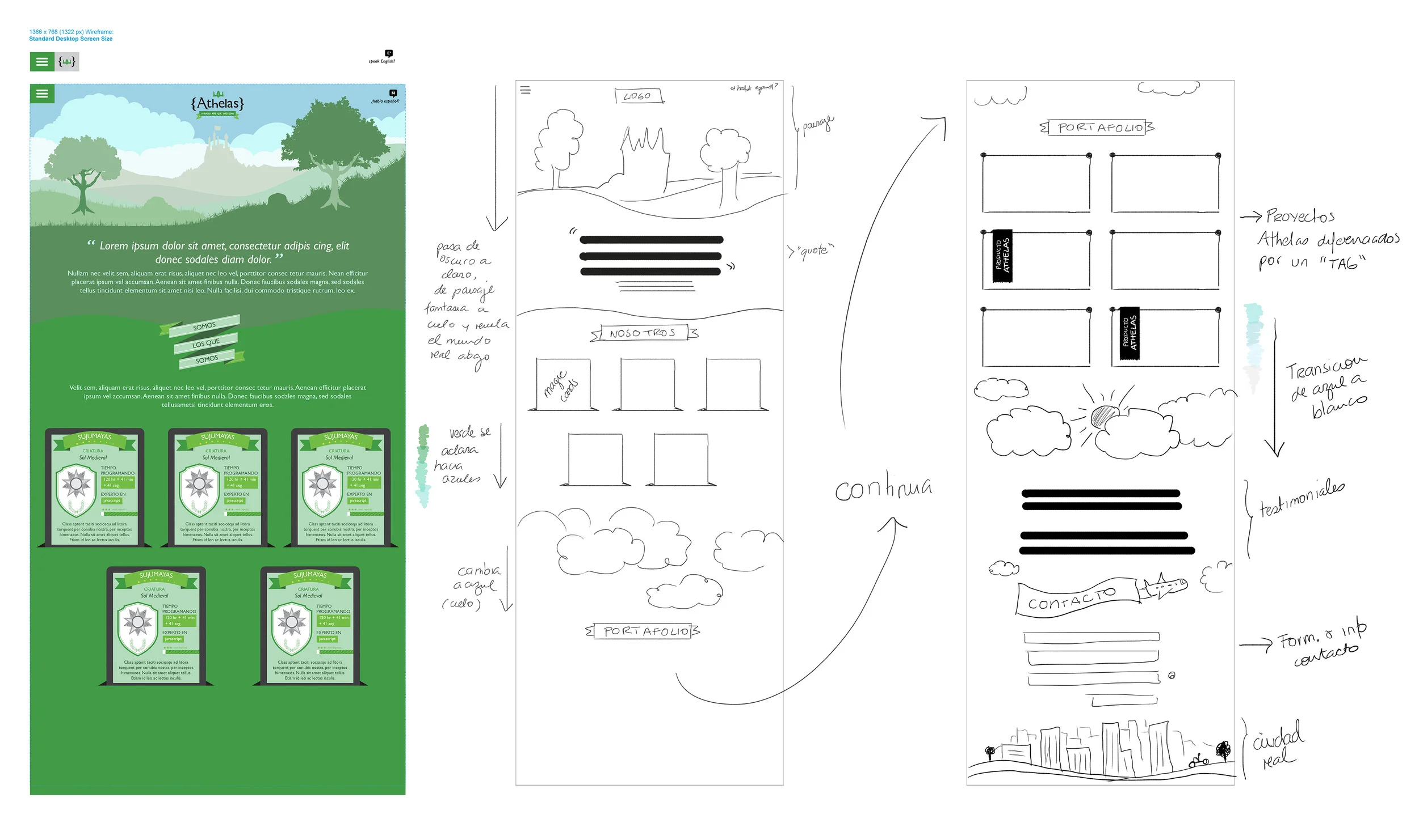
- Their whole theme was based on phantasy, online video games, lord of the rings kind of feel, and this is the image they gave me as a reference to start:

- The "meet the team" section had to be interactive and unique. They wanted to use "magic cards", but apparently I am not nerdy enough, so I had to look it up:

Typical magic card

I like this funny version better....
They were on a hurry, so we got to work right away with a rough wireframe.
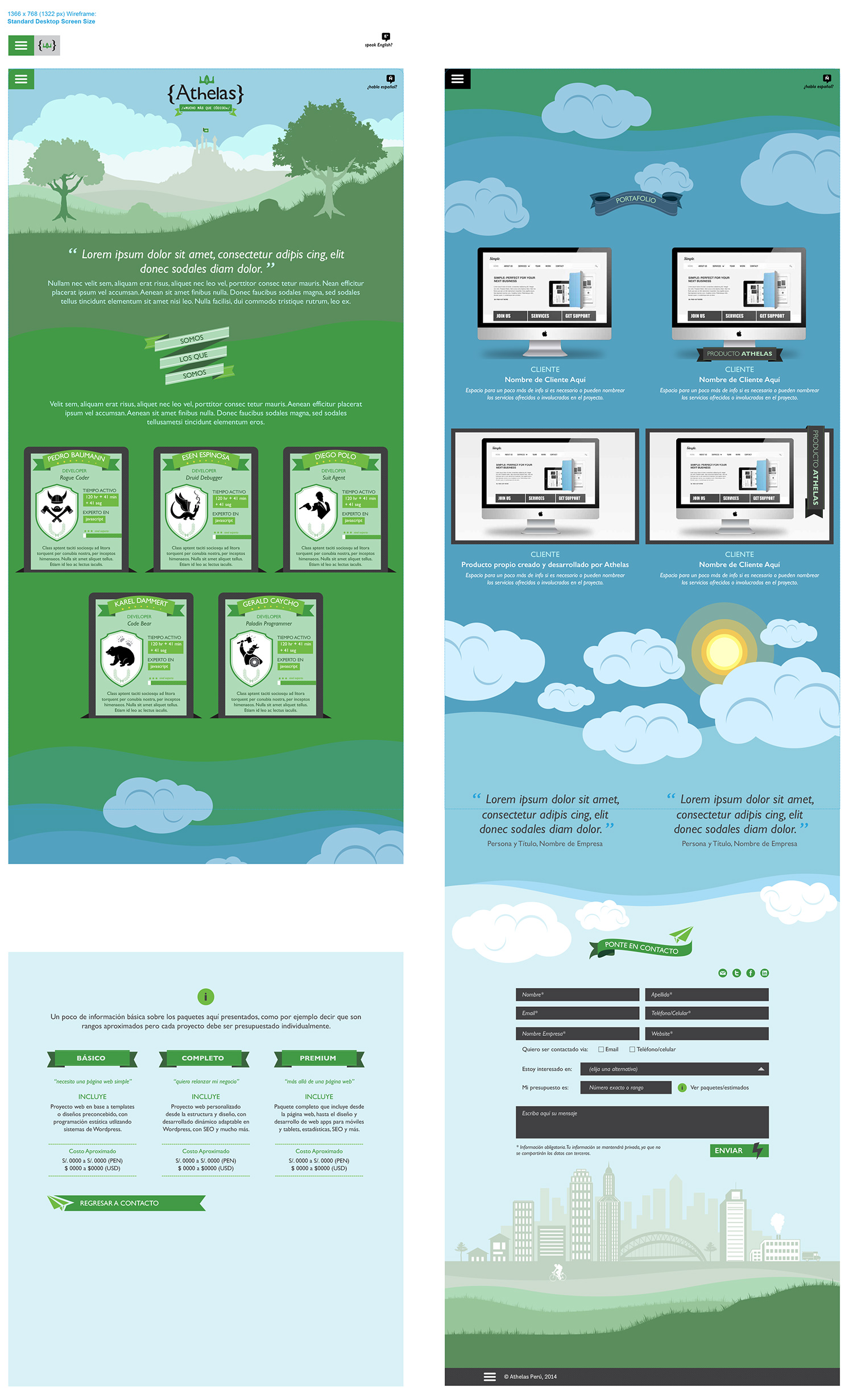
Following the concept of a fantasy world and inspired by the story of Jack and the Beanstalk I came up with the idea of having the "World of Athelas" – castle included – exist above the real world, showing the website content in between the 2 worlds. As visitors scrolled down, they experienced the different layers between the fantasy world and the real one:

With the wireframe approved, I moved on to the design process. First tracing the background image and cleaning it up a bit, and then adding some more details.
As I do with my clients, I wanted to get their feedback early on, to make sure we were going in the right direction, so I presented them just the first section of the design, where we selected the typography, colors and other design elements, including the magic cards:
Design version 1:

With this early design approved, I moved on to the rest of the website, creating transitions for the different sections and details for the "magic cards".
Design version 2:
In this second version I showed how the menu and the logo would change as the user scrolled down.
Based on their nick names, I came up with icons for each person's magic card. I also gave them 2 alternatives for their website portfolio presentations, among other ideas...
Design version 3:
After reviewing version #2, we decided the flow would work better if the portfolio was above the "meet the team" section. Changing the order though, resulted a bit more difficult than anticipated. I wanted to keep a sober background color that wouldn't interfere with their portfolio pieces and the transitions didn't work as well that way...

Another element we worked on were the magic cards. The idea was to have these magic cards be interactive. If a programmer was "on duty" actually coding, users could see the hours worked and the progress bar moving. As they reached certain amount of hours, the bar would change into a "completed" state. It also had to show the developer's "specialty language", nick names and real names, and a short description text. We also wanted to differentiate "active states" versus "offline states", so I came up with two alternatives:
- Making the "offline state" blue (almost duotone) to highlight the "online" ones.
- Adding a thin yellow line around the "online" magic cards, which was a more subtle alternative and the one that got selected.

Final version:
Since the background transitions weren't working in version #3, I came up with the idea of going beyond the sky and into the galaxy, to separate the two worlds. This "out of space" idea worked well, because it allowed me to have a dark sober background for their portfolio pieces and a much needed transition back into the "real world sky". It also created a more evident distinction between the two worlds.
We also decided to change the typeface. The client wanted to use Gill Sans, but needed a more web-friendly typeface for the web, so we went with Alegreya Sans, which shares a few aesthetics elements of Gill Sans, but is meant to be use and read on screens, and has a large family (versions) for versatility:

Screen views as users scroll down:

"Restrictions" are sometimes just challenges that push us to come up with more creative ideas. In this project, for example, I had a time restriction, but at the same time, because it was a developers' website, it offered unique opportunities for fun stuff like "easter eggs".
From the language menu to the different sections and the journey through the 2 worlds, this website offered a unique user experience and made Athelas stand out from the crowd. They went from being 2 developers working from home, to having 4+ employees, a full-time office and new online services being launch this year. The client was very happy and I'm proud.
Visit their site at: www.athelas.pe
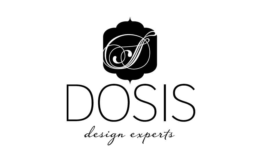
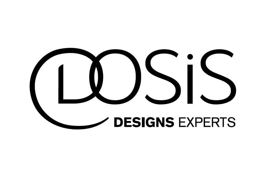
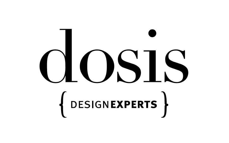
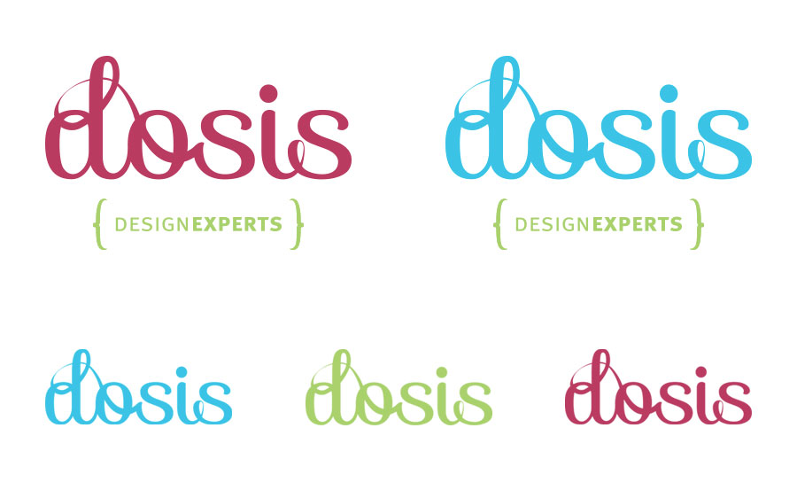
Logo design process for Dosis
In this post, I want to share the design process that let to the brand "Dosis – Design Experts", which was developed in 2012.
The most common phrase I hear when I say I'm a designer is "I want a logo!", which is just a starting phrase that leads to a long conversation about branding. Yes my friend, branding is what you need, a logo can't do all the selling work for you business. Having a coherent and consistent brand with a clear message can become and incredible valuable asset.
But creating a brand is no lame lazy job, it requires a lot of effort, time, a clear idea, a good service/product and lots of back-and-forth... This is why I thought you would be interested on taking a look at what's involved in the design process of a brand.
In this post I want to share the work done for "Dosis – Design Experts", launched in 2012. The client had already registered the name and tagline, so we went straight to developing the creative brief, where we were able to define all the key information about their brand, objectives, goals, as well as key concepts:
“Dosis is a boutique interior design studio, with a 360 kind of service, that goes beyond just decore, covering all the client’s needs. We want to give our clients ‘a dosis’ of style and art to their lives”
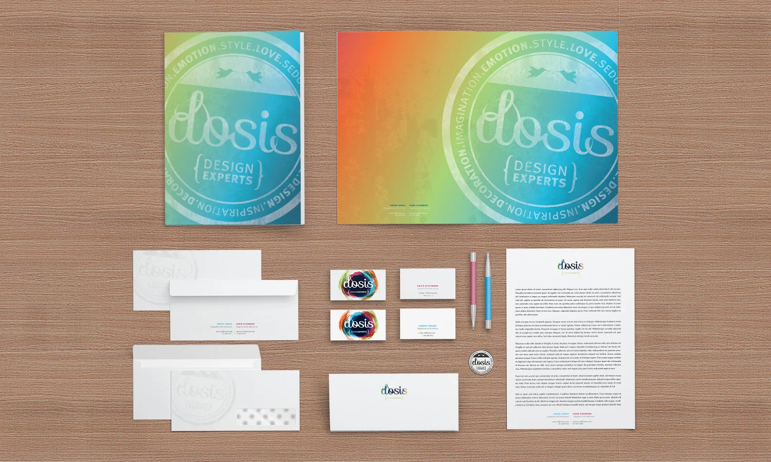
The brand had to inspire curiosity and playfulness, but also classic elegance and creativity, so concepts of vintage looks, textures, hand-made elements, and bright colors were important to maintain. The client specifically requested to have a typographic logo and a secondary version to be used as a stamp.
With this in mind, along with all the information gathered in the creative brief, I started with an esencial first step. The moodboard (you can download the complete moodboard here):

I worked with the client to narrow the complete moodboard to essential visual examples that communicated the "look & feel" of the brand we wanted to create. From the moodboard we also extracted a starting color palette:

There are great tools to create color palettes. I tend to use the images of the moodboard to find the colors and for that I either use Photoshop (pixelating the images to the max) or online tools like Color Scheme Designer, Colour Lovers, or Paletton.
With the moodboard and color palette alternatives set, I started the design process. Always with pen and paper, because my brain just works better that way... here are some examples of that:
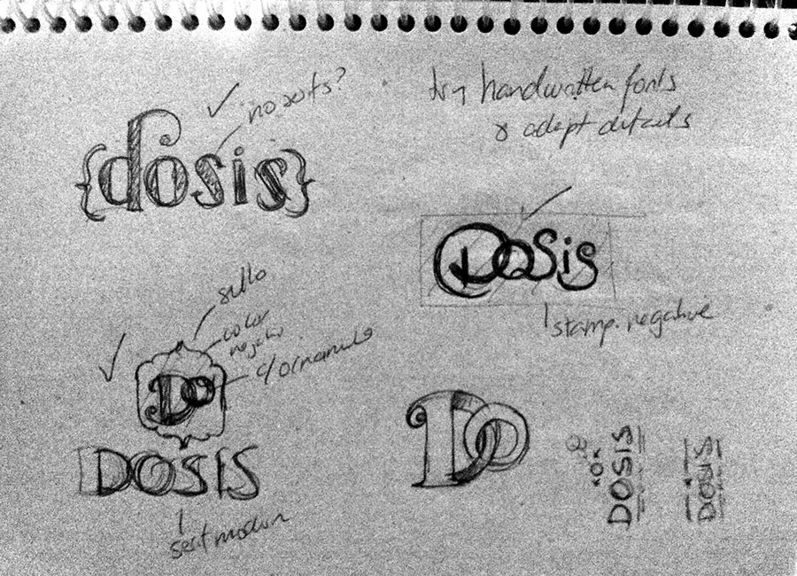
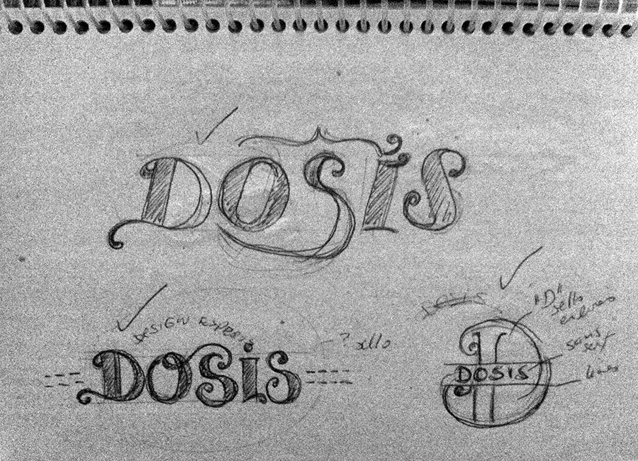

Depending on the client, sometimes I actually involve them early on the design process. Some people are better visualizing "designs in progress", some are not, so I'm cautious about it. In this case, since both partners in the company were designers, I actually showed them some sketches early on in the process.
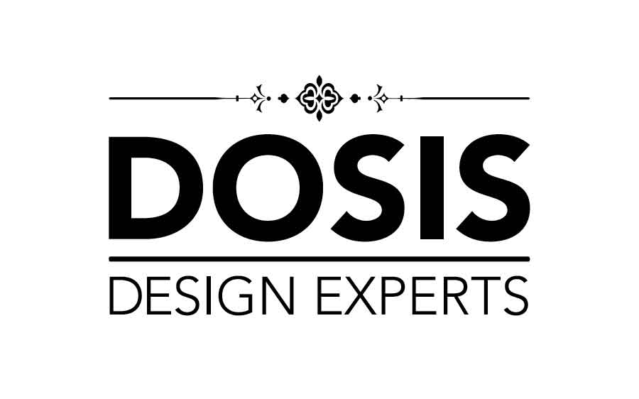
From here I started to edit the ideas to create clean designs in the computer, giving the client different alternatives. I always start only with black and white designs, so we can focus on the forms first.
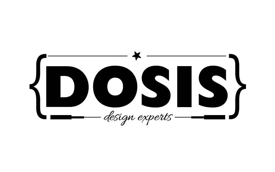
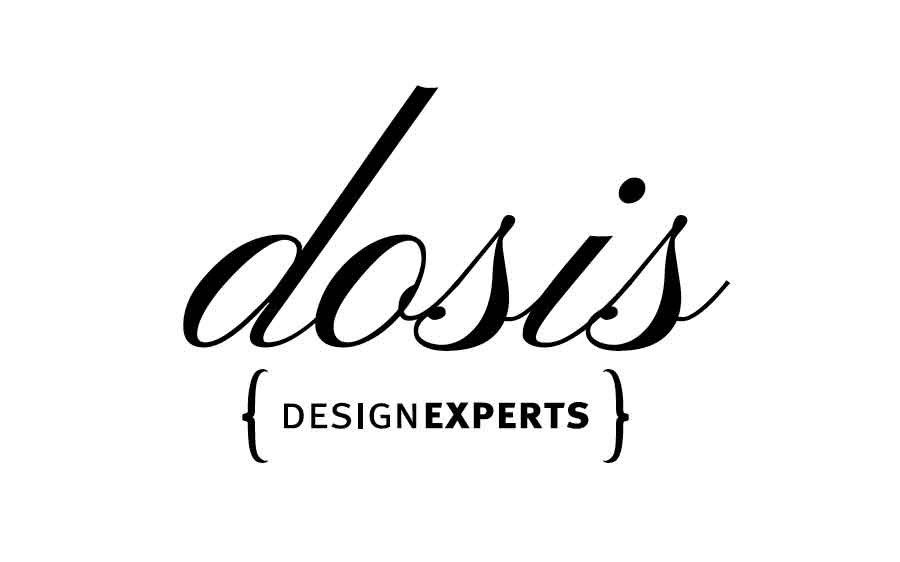
PRESENTATION 1


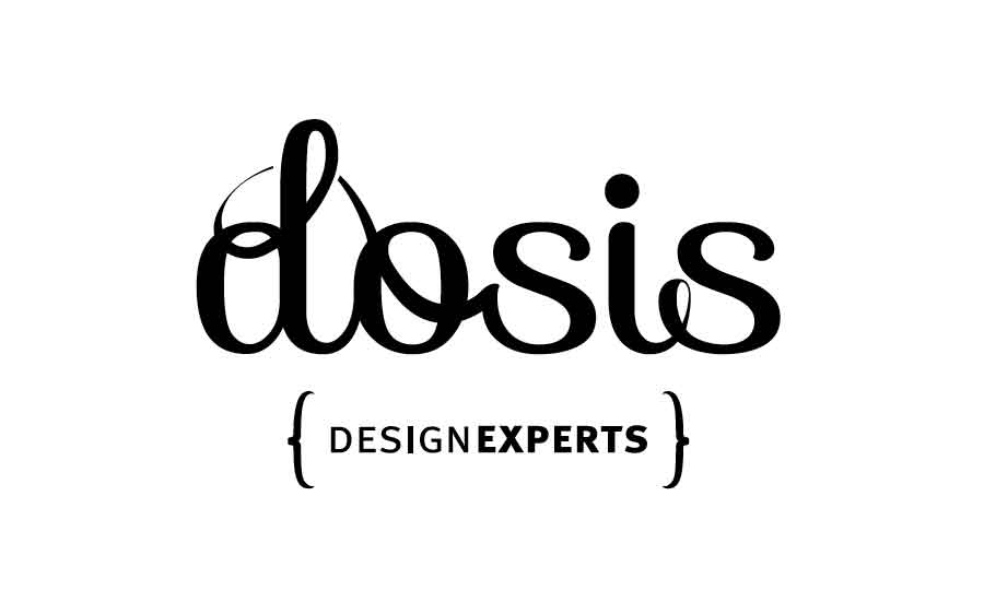
After this presentation, one of the business partners decided she wanted to see some more modern options with a bit less vintage feel, and thicker fonts. So we set up to explore that, while maintaining the key concepts established on the creative brief.
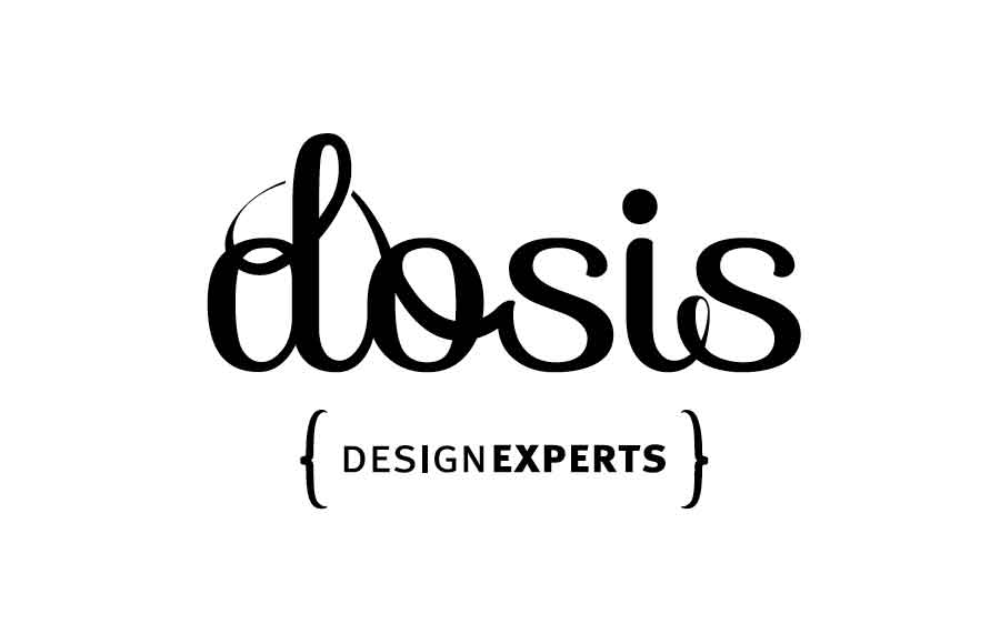
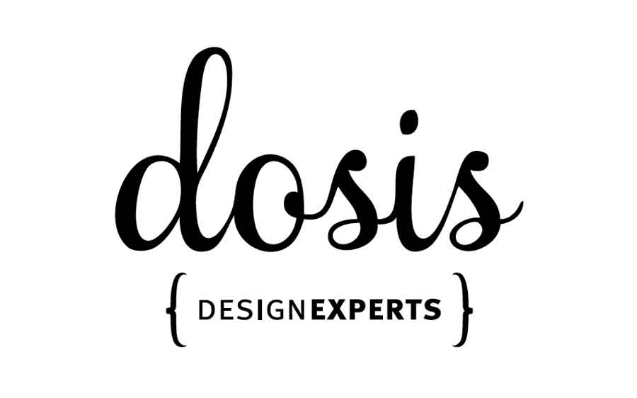
PRESENTATION 2
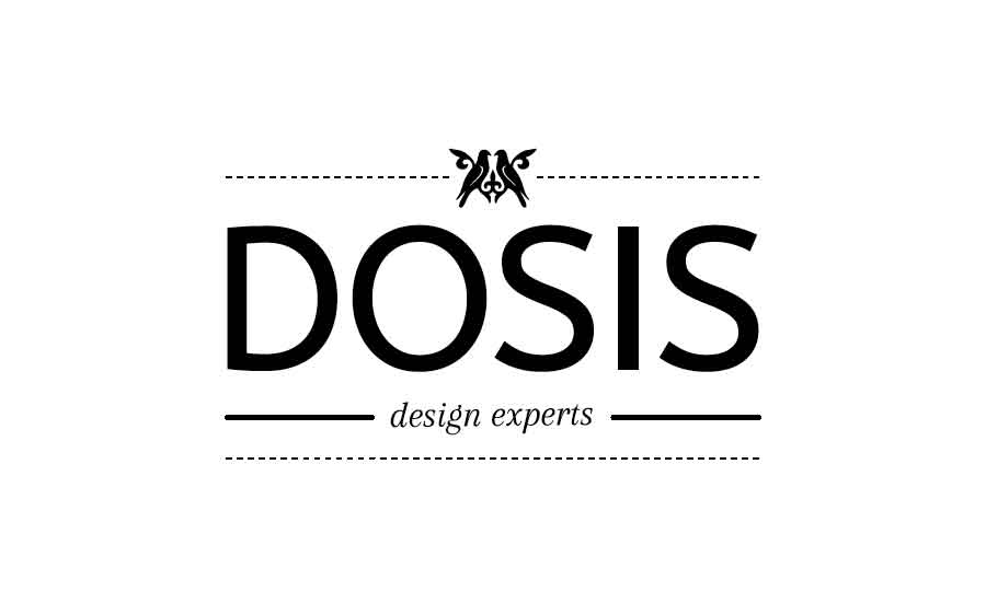
We did 4 rounds of designs, each presentation carrying between 3 to 5 alternatives. After a few back-and-forth, one logo design constantly survived since presentation #1, and was eventually selected as the right alternative.
PRESENTATION 3
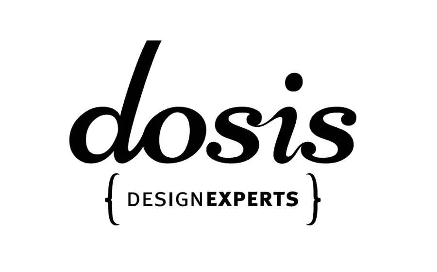
This was one of those situations, where the client loved a design since the first presentation, but was still curious to "see what else is up there". This was actually good for the design, because it allowed us to validate the logo against other alternatives and helped the client feel confident about their final decision.
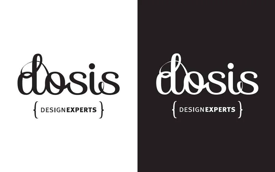
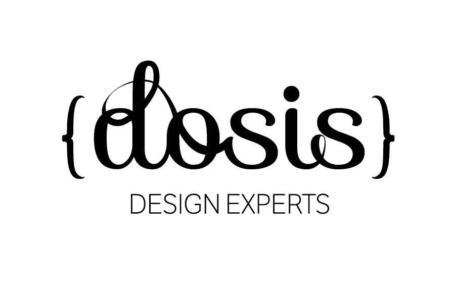
THE APPROVED DESIGN:

From here we started working on adding color, texture and creating different applications for a very flexible brand image:
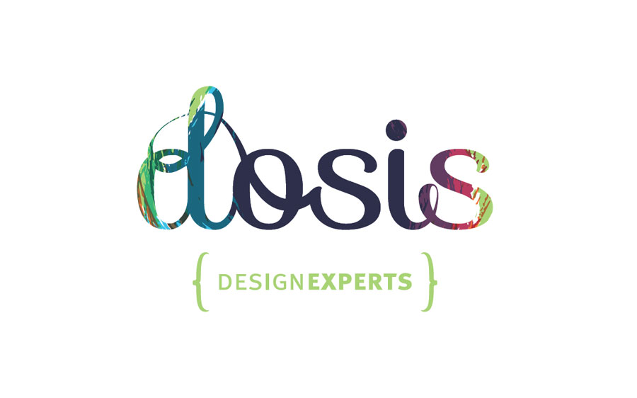

And of course, the seal, which was then applied to the stationery and eventually used in their floor-plans a "quality seal":


Have a smile!
Let's start the year full of color and positive vives, shall we?
My treat!
Not everyday is fun or perfect, as entrepreneurs we know things can get complicated fast and 24 hours is not enough for our extensive to-do lists. But, we should all take a few minutes everyday, to be grateful for still being around, to be able to work, and keep on #Exploring!
In honor of this idea, I want you to experience your days full of color and positive vibes. And to jump start this concept, I want to share with you his very cool video about creativity that makes me smile every time I watch it, enjoy!
The speaker at this November 2011 CreativeMornings NewYork was Jessi Arrington, Co-Founder of WORKSHOP and all-around Rainbow Queen. The event was hosted in Brooklyn.
* CreativeMornings is a monthly breakfast lecture series for creative types. Each event is free of charge, and includes a 20 minute talk, plus coffee! You can join us in numerous cities around the world. For the Colorado area visit: Creative Mornings Denver
Inspiration Day – The work of David Smith
It's is always refreshing to discover the amazing work of artists and designers I didn't know before. David Smith's work is definetly unique, and absolutely incredible.
Sorry folks, not everything has to be about business... sometimes you've to step away and look at inspiring things, to get inspired!
For me, it's is always refreshing to discover the amazing work of artists and designers I didn't know before. David Smith's work is definitely unique, and absolutely incredible. This is an article from 2013, but that is worth reading if you haven't do so before. If you don't feel like reading, I recommend this fun video:
Fontfeed – Stunning Artwork for John Mayer’s Born and Raised
To visit David Smith's website go to: davidadriansmith.com
Traveling feeds creativity...
...because it opens your mind, breaks boundaries and pushes you to think and feel out of the box.
...because it opens your mind, breaks boundaries and pushes you to think and feel out of the box. Feeling out of place is good, because if forces you to notice the world around you, to pay attention to it and to yourself. All these while (usually) having a great time.

Our home for 2 months, Hanoi – Vietnam
Between 2011 and 2014, my husband and I, decided to travel while working, taking advantage of the fact that we were both freelancers and could work from anywhere with a decent internet connexion. We wanted see the world (or part of it at least) while continuing with our careers, so we packed out bag-packs and head for the airport with a one way ticket to Hong Kong...

Hubud coworking space – Ubud (Bali) Indonesia
For 3+ years, we work-traveled through the US east coast, Canada, Peru, southern Chile, South East Asia, New Zealand, and Australia.
Planning the longest part of the trip, which was 8 months in South East Asia and Australia, took so much time...ohhh so much timeeee... that I decided to help future freelance adventurers with a simple blog.
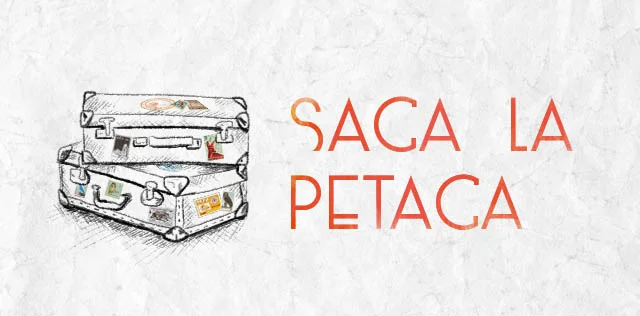
In my travel blog, which you can read here. I shared not only my experience and opinions about each place, but specific information about it too: good places to eat, best internet connexion, good place to stay, what to do/see/visit, worth and not worth visiting, etc. All these oriented to a Spanish speaking audience (sorry America, there were way to many travel blogs in English already).
So, if you are curious and want to read it (maybe practice your Spanish while doing so?), please visit Saca La Petaca. I hope you enjoy it. OH! and pack your bags, travel is healthy!

Trekking around Cusco – Peru, our home for 4 months